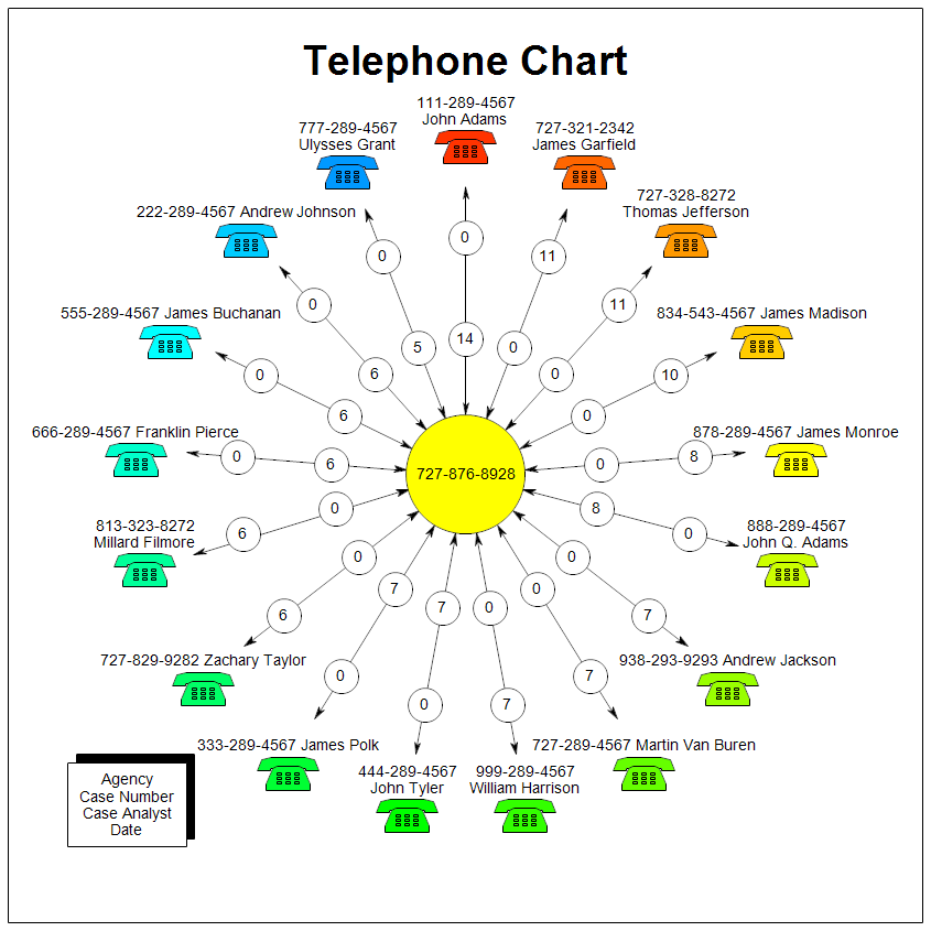
RFFlow can automatically generate a Telephone Frequency Analysis Chart from your data. You can
save an Excel spreadsheet in .csv format and then RFFlow will open the .csv
file and draw the chart. For details as to how this is done, see:
How to Draw a Telephone Frequency Analysis Chart
The center phone number in the chart shown above is the target of the
investigation. The highest frequency of calls are to the right, starting in
the circle at position 12:00 noon and decreasing as you go clockwise. You can
select to show only a certain number of calls to make the chart more readable.
The outer circle has the number of calls made from the target to the outer
phone. The inner circle has the number of calls made from the outer phone to
the target.

Professional Flowcharting Software
|
|
|
|
|
|
|
|
